throughout our careers as engineers we encounter numerous similar tasks disguised in different forms, maybe having slight differences. Every time we encounter the same task, we think it through based on our previous accomplishment of the task and figure out a better way to do it according to our gained experience. In the field of science, this is the natural progression of the learning experience - trial and error. Nevertheless, many have tried before us and have passed best practices that we [as a community] adopted as principles and guidelines to become an organic extension of our workflow, intrinsically applying them with little thinking effort.
Lucid isn’t any different, it is an accumulation of experiences in building scalable products to serve various industries by interchangeable teams. Based on the many mistakes we’ve made and the suffering we dealt with every time we revisit a “legacy” project, or during the onboarding process of someone new to the team, where the training process cannot keep up with the variety of opinions that’s been implemented in different projects, regardless of whether they’re right or wrong, they are many and have no single basis, a foundation, or a single architecture.
we wanted something simple [KISS] yet effective at scale. Enjoyable to work with by all levels of engineers alike. And elevates the level of understanding abstraction throughout its easy learning process.
simply put:
name
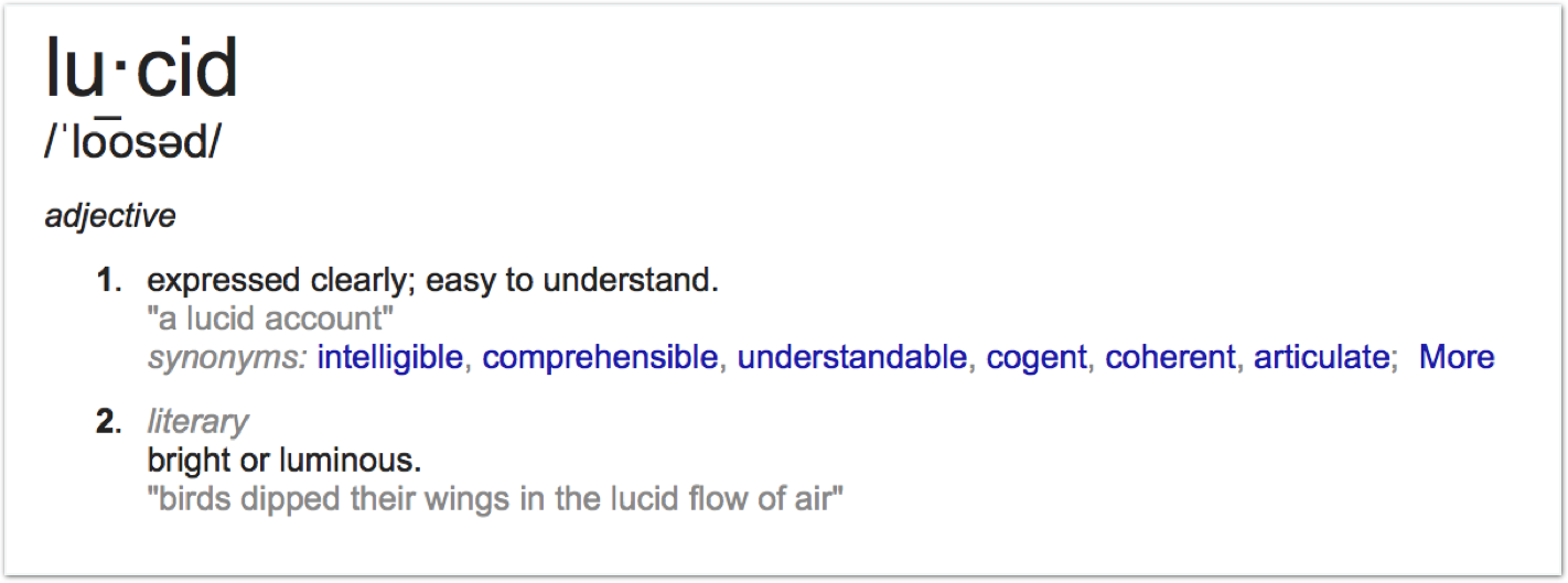
“expressed clearly; easy to understand” marks the fundamental objective that the architecture intends to achieve in code.

emblem

foundation
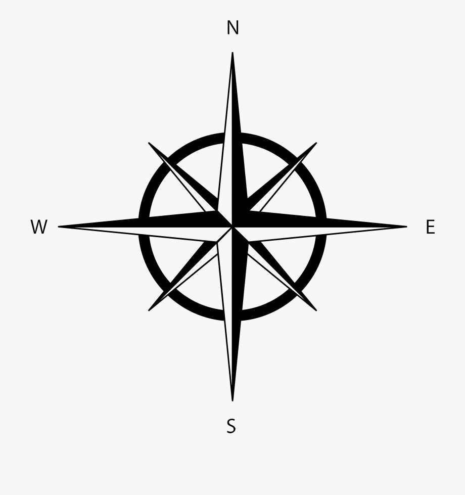
the more you look at it, the more different shapes you will see. Some of these shapes may seem like a building or a block and they go in different directions. However, they are all starting from the same center - The Foundation.
resilience
from it emerges lines that have equal height, though go in different directions but have similar characteristics - representing the malleability of Lucid. Though, without guidelines and principles the outcome will not be desirable. Hence the straight lines that go in one and only one direction, representing the responsibility of each component in our code regardless of its destination.
direction
the compass was an inspiration to the logo - without it we will surely get lost. Not knowing where we are, in which direction to go and how to go there is even worse. However, if we’ve been down the same road before it will be easier to know what should happen next.
like a compass, Lucid provides the guidance and acts as a reliable companion to your code navigation journey.
also, a compass has no final destination and is only there to lead us wherever we wish to go, similar to any project that is ever evolving but the compass will never change direction.
clarity
from darkness to light. The dark end of the logo represents the chaos that our projects end up having after a long period of work and re-work, the variety of features they contain along with their changes. Going through the foundation (the center) - in this case Lucid - our projects go out of the other side in light - clear, understandable and easy to work with.